Bathroom Colours That Make a Small Bathroom Feel Bigger
February 20, 2026

Central Coast Kitchens & Bathrooms understands that in a small bathroom every design decision carries extra weight. Colour is one of the most powerful tools for transforming how a space feels, yet it is often misunderstood. The right palette can visually stretch walls, soften hard edges and reflect light in a way that makes a compact bathroom feel open, calm and inviting. The wrong choices can leave it feeling cramped, heavy and disconnected from the rest of the home.
For homeowners considering bathroom renovations in Central Coast, colour selection plays a critical role in how spacious the finished room will feel. In this article, we explore which tones help expand a tight space, how light and reflection influence perception and why finishes such as tiles, cabinetry and benchtops need to work together rather than compete. We also cover contrast levels, grout colours and the role of natural and artificial light, so you can approach your next project with confidence and a clear design direction.
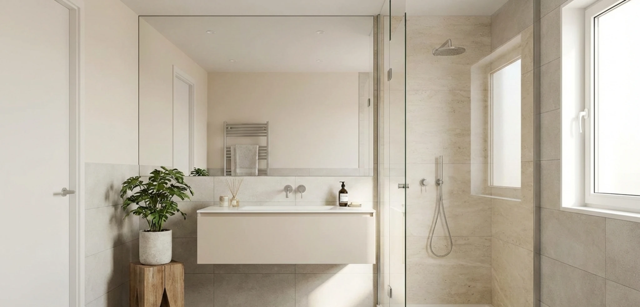
Light neutrals are one of the simplest ways to make a compact bathroom feel wider, taller and more relaxing. By reflecting more light and visually softening edges, they help small rooms on the Central Coast feel airy instead of cramped, even when the floor plan cannot be changed.
Central Coast Kitchens & Bathrooms recommends light neutral schemes for many local homes because they suit every style, from coastal to contemporary and they are easy to update with new towels or accessories over time. The key is choosing the right undertone and applying it consistently across walls, tiles and cabinetry so the space reads as one calm backdrop.
In small bathrooms bright whites can sometimes feel harsh, especially with strong natural light. Soft off-whites and pale greys usually work better, as they provide brightness without glare.
Popular options include:
On the Central Coast many homes have warm natural light, so slightly warm neutrals often look more balanced than cool blue-based whites. Our team typically tests two or three sample pots on different walls to see how the colour changes from morning to evening before making a final choice.
For a small bathroom it usually works best to keep the main surfaces within the same light neutral family. This reduces visual breaks and makes the room feel less busy.
Walls: Painting walls in a soft neutral with a low sheen helps light bounce without highlighting imperfections. For very small rooms our designers often run the same colour on the ceiling to create a seamless envelope that appears taller.
Tiles: Large-format light neutral tiles on walls and floors minimise grout lines and make the room look more expansive. Choosing a grout colour that is close to the tile shade avoids a grid effect that can shrink the space.
Cabinetry: Light neutral cabinetry, such as white, off-white or pale timber-look finishes, keeps the vanity from feeling bulky. If contrast is desired, a slightly deeper neutral on the vanity with lighter walls still maintains a spacious feel.
Light neutrals perform best when fixtures and lighting are selected to support the airy feel. Glossy white basins and toilets blend into the palette instead of standing out as heavy blocks. Frameless or minimal-frame shower screens allow the neutral tiles to run uninterrupted.
Good lighting is essential. Our team often combines:
This layered lighting enhances the reflective quality of light neutral surfaces so the bathroom feels open and welcoming at all times of day.
Cool and muted colours are one of the most effective tools for making a compact bathroom feel larger. Soft blues, greens and greys visually recede, which helps walls appear further away and reduces that boxed-in feeling that is common in small spaces. For Central Coast homes where bathrooms are often narrow or windowless, the right cool palette can introduce a calm, airy atmosphere without needing to change the room’s layout.
By choosing gentle, desaturated tones rather than strong, saturated colours, it becomes easier to layer finishes and textures without the space feeling busy. These hues work particularly well with the natural light typical of coastal properties and can also soften the look of artificial lighting in internal bathrooms.
Light blue is ideal for creating a sense of openness because it mimics the colour of sky and water. In a small bathroom this trick makes surfaces feel further away and gives the impression of depth. Instead of bright or primary blues, our designers recommend:
On the Central Coast these shades pair beautifully with white or off-white fixtures and brushed nickel or chrome tapware. Using a slightly deeper blue on the floor and a paler blue on the walls can visually lift the ceiling and make the room feel taller. To avoid a cold look, keep grout lines light and introduce warmth through timber-look vanity fronts or rattan accessories.
Muted greens bring a relaxed spa feel and can trick the eye into reading the room as more spacious by connecting it with nature. In small bathrooms sage, eucalyptus and soft seafoam are particularly effective. They are light enough to bounce available light yet have enough colour to add character.
A sage green feature wall behind the vanity can add interest without closing the room in, especially if the remaining walls are kept an off-white or very light grey-green. Large-format satin-finish tiles in pale green reduce grout lines, which helps the bathroom appear wider. On the Central Coast, where many homes open to leafy gardens, these greens can echo outdoor views and extend that sense of space indoors.
Cool grey is a versatile backdrop that lets fittings and mirrors take visual focus while the walls recede. For small bathrooms it is important to choose light, soft greys rather than dark charcoal. Blue-grey or silver-grey tones can make the room feel crisp and airy, especially when combined with plenty of white.
Using the same pale grey tone on walls and floor tiles with only a slight variation in shade minimises visual breaks and makes the footprint read as larger. A matte or satin finish works better than high gloss in compact rooms, as it reduces glare yet still reflects enough light. On the Central Coast, where many homes feature coastal or contemporary styles, muted greys sit comfortably with both white stone benchtops and warm timber accents, creating depth without dominating the space.
A monochromatic colour scheme uses different shades, tints and tones of a single base colour. In a small bathroom this approach is one of the simplest ways to make the room feel more open because the eye is not constantly stopping at sharp colour changes. Instead, the space reads as one continuous surface, which tricks the brain into perceiving a larger area.
For Central Coast homes where bathrooms are often compact and compete with limited natural light, a well-planned monochromatic palette can calm the room, reduce visual noise and highlight the quality of the fixtures rather than the room size. The key is choosing the right base colour and then layering it thoughtfully across tiles, paint, vanity finishes and accessories.
When walls, floors and fixtures sit within the same colour family boundaries between surfaces become softer. Corners recede, the ceiling looks higher and the room feels less boxed in. Strong colour contrasts, such as dark floors with bright walls or bold feature tiles, can visually chop up a small bathroom, so our team usually recommends a gentler transition.
Light neutrals work best for expanding space. Off-white, warm beige, pale grey or soft greige reflect more light, which is ideal for internal ensuites or older Central Coast properties with smaller windows. A soft warm grey on the walls with slightly darker grey floor tiles and a white vanity top still reads as one colour story but has enough variation to avoid looking flat or clinical.
The starting point is to select a base colour that suits the home and the amount of natural light. For coastal properties near Terrigal or Avoca, a warm white or sandy beige complements the surrounding environment. For contemporary homes in Gosford or Erina, a cool light grey or stone tone often works well.
Once the base is chosen, it should be used in several strengths rather than pairing it with unrelated colours. For example:
Central Coast Kitchens & Bathrooms also recommends limiting patterns in a very small room. If a pattern is desired, a subtle stone veining or a gently textured tile in the same colour family keeps interest without reintroducing clutter.
Monochromatic never has to mean boring. Instead of adding contrast through colour, our designers use texture and finish. Matte wall tiles paired with a satin vanity finish and a slightly glossy feature tile in the same tone add depth while preserving visual simplicity.
Metal fixtures are another way to break up the scheme without shrinking the space. Soft brushed nickel, brushed brass or black tapware can sit against a monochromatic backdrop as a refined accent rather than a competing colour. Towels and accessories are then chosen in closely related shades so the overall effect remains calm and spacious rather than busy.

Many homeowners assume that a small bathroom must be all white, but darker colours can actually make a compact space feel sophisticated and cosy without shrinking it. The key is how the dark tones are used, where they are placed and how they interact with light and finishes.
Bathroom renovation specialists often combine deep hues with smart layout and lighting strategies so clients can enjoy dramatic colour and a sense of openness at the same time.
Placement matters more than the exact shade. Used in the right areas, dark colours can visually deepen the room instead of closing it in.
A dark feature wall behind the vanity or at the end of the room can create a sense of depth, especially when the surrounding walls are lighter. In a narrow bathroom a darker back wall can trick the eye into seeing a longer space. Dark floor tiles paired with light walls help ground the room while keeping the upper half feeling airy. This contrast draws the eye upward, which is ideal in bathrooms with standard ceiling heights.
Bathroom renovation specialists often recommend keeping ceilings and upper wall sections light in small bathrooms, then introducing darker tones at eye level or below. This maintains a feeling of height while still allowing rich colour.
Dark colours work best in a small bathroom when they are carefully balanced with lighter elements. Without contrast, a deep palette can absorb too much light and feel cramped.
Pairing charcoal, navy or deep green tiles with white or soft neutral walls keeps the space bright. A dark vanity looks much lighter when it sits against pale wall tiles and is topped with a light benchtop, such as white engineered stone. Gloss finishes on dark tiles or cabinetry reflect more light than matte finishes and
can help a small Central Coast bathroom feel less enclosed.
Generous use of mirrors is essential. A large mirror above a vanity or a mirrored shaving cabinet bounces light around and doubles the visual space. When a dark feature wall is reflected in a mirror, it can feel like a sophisticated backdrop rather than a solid block of colour.
Lighting is crucial when working with darker palettes in compact bathrooms. Without good lighting even the best colour choices can feel heavy.
Layered lighting works well. Overhead lighting provides general brightness, while wall sconces near the mirror reduce shadows on faces and prevent the dark colour from feeling flat. Warm white LED lighting softens deep hues and keeps them inviting, which suits many Central Coast homes where bathrooms are used early in the morning and in the evening.
If there is a window or skylight, the renovation experts will often place darker tiles or cabinetry where natural light hits them directly. The natural light highlights the colour and texture and stops it from feeling oppressive. Combining good artificial lighting with natural light where possible allows clients to enjoy dramatic bathroom colours without sacrificing a sense of space.
Some colours visually pull walls, ceilings and floors closer together, which can make a compact bathroom on the Central Coast feel tight and closed in. Understanding which shades and combinations reduce the sense of space helps homeowners avoid expensive repainting or retiling later.
Our designers see the same colour mistakes repeated in small bathrooms. Certain dark, strong or highly contrasting palettes can be beautiful in larger rooms but quickly overwhelm a smaller footprint if they are not carefully balanced with light and texture.
Deep charcoal, navy blues, chocolate browns and black can add drama, but when they cover most surfaces in a small bathroom, they tend to absorb light and visually shrink the room. A dark floor paired with dark walls and a dark vanity creates a cocoon effect where boundaries blur and the space feels compressed.
If a client loves dark tones, our team recommends limiting them to accents rather than the primary canvas. For example, a charcoal vanity or feature wall can work if the remaining walls, tiles and ceiling are a soft, light neutral. Using dark mosaics on every wall and the floor in a compact ensuite usually results in a space that feels more like a cave than a retreat.
Gloss level also matters. Dark matte tiles on every surface will soak up available light, especially in bathrooms with smaller Central Coast windows or frosted glass for privacy. Swapping some surfaces for lighter semi-gloss tiles immediately opens the room by reflecting more natural and artificial light.
Highly saturated colours such as bright red, royal purple, emerald green or vivid orange can make a small bathroom feel busy and closed when used in large uninterrupted areas. These hues draw intense attention to the surfaces they cover, which can highlight the limited dimensions of the room.
Large sections of bold colour on walls or cabinetry are particularly overwhelming when the ceiling is low or the room is narrow. The eye stops on the colour instead of moving through the space, so the bathroom feels shorter and boxier. This is especially noticeable in windowless powder rooms where there is no view outside to balance the intensity.
For Central Coast homes that want colour, our team prefers to use strong shades in measured amounts, such as a feature niche, a framed mirror or small decorative accents. Pairing those with low-chroma neutrals like soft greys, warm whites or pale greige keeps the room feeling open while still adding personality.
Sharp contrast between walls, floors and fixtures can visually slice up a small bathroom and make it appear cluttered. Classic examples include very dark floors with very light walls or a stark black and white checkerboard effect. Each change in colour reads as a boundary which shortens the perceived length and width of the room.
A dark vanity against a very pale wall with a strongly coloured benchtop and contrasting grout lines can quickly become too visually busy for a tight layout. The eye jumps from one contrast to the next instead of reading the room as a single cohesive volume.
To avoid this confined feeling, our designers favour gentle contrast instead. Keeping the floor and wall colours within a few tones of each other creates a continuous envelope that feels larger. When contrast is desired, such as with black tapware, it is kept to smaller elements rather than large surface areas so the bathroom still feels calm, open and well proportioned.
In the end, choosing bathroom colours that make a small bathroom feel bigger is about far more than just picking a “nice white”. Throughout this article, we’ve explored how soft neutrals, warm whites and gentle greys create an airy, open feel; how cool blues and greens can bring a calm, retreat-like atmosphere without closing the room in; and how strategic contrast on trims, vanities and feature walls can add depth and interest without overwhelming the eye. We’ve also covered the impact of gloss levels, tile size and grout colour, the way natural and artificial lighting interact with your chosen palette and the importance of tying your wall colours, tiles, joinery and fittings into one cohesive scheme.
Ultimately, colour should work for your lifestyle, not against it. The “best” palette is the one that reflects how you want to feel in your bathroom, suits the style of your home and stands the test of time in everyday use. The right choices can make a compact Central Coast bathroom feel brighter, taller and more generous, while also adding value and comfort to your home. When you’re ready to translate these ideas from the page into a real, functional space, thoughtful planning and expert guidance will ensure your colour selections don’t just look good on a sample card; they’ll transform the way your bathroom looks and feels every single day.

